How will the Post COVID-19 pandemic landscape in business be changed? Are we headed to a future like the Jetsons or one like Mad Max? Companies who once feared remote workers are waking up to the benefits of this work/life balance. Others are in panic mode because “we’ve always done it this way” no longer applies.
As a Data Science company, we are always looking ahead. One thing we get asked about is what should business be doing now to prepare for the world in the new normal. At our first in-person lunch meeting Post COVID-19 pandemic, we came to the conclusion the two book-ends are: Jetsons or Mad Max.”
We believe the major change is how customers now interact with companies. We have, because of the pandemic shown that companies can actually do just fine working from home, can deliver good like groceries, food, and even luxury items without the in-person experience, and that companies can do a better job using technology to deliver what the customer wants, when the customer wants it.
This is pandora’s box. We can’t go back. Because we had to do this to survive, now we have to continue to do it as part of our business model. However, what most companies built in haste, isn’t scalable. It is now time to rethink how we use the data we have (and the data we can get) to build a scalable solution that gives us insight into what customers want, and gives the customers what they desire–better access.
Interestingly enough, when going back through our past project history, we realize we have been building solutions for just this problem for years. Take for example the persona model we built for Omaha Public Power District (OPPD). It is a great example of how to use data for greater impact.
For OPPD, one of the few publically owned utilities in the entire country, our predictive model allowed them to understand which product or service each household had the highest chance to purchase, and then give that insight to their sales and marketing teams. This meant that:
Their customer service agents now had access to which products to recommend when they called in.
Their sales team knew which households were most likely to want each product, and
Their marketing team knew which product to market to each household.
Predictive modeling like this allows companies to “hit” more than “miss”. If your able to be more effective, even by a small margin, you may edge out your competitor. Tell that to Jacob Kiplimo who was on pace to set the world record for a 43:00 15km run. Kiplimo raised his arms to celebrate before crossing the finish line. It was then that Kibiwott Kandie passed him and finished in 42:59 and was the first to break the record instead.
Understanding how to start with data-driven decisions can be tough. Lucky for you, there is a company that can help you get this kind of insight, and teach you how to do it. Contact Us today and we’ll be happy to help ensure you hit the ground running post-COVID.
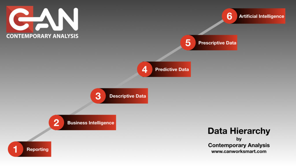
Machine Learning, Business Intelligence, and Artificial Intelligence are buzz words that are being thrown around at planning sessions a lot these last few years. They have real meanings that most people don’t understand. They are using them to mean “more sophisticated at using data to make decisions”. And while that is right, there is a right way and a very wrong way to lead your company down the path of using data to make data-driven decisions. After 10+ years of helping companies understand what that path is, we wanted to help you the reader understand the order and the real definitions of the buzz words. This way, you can not be educated, but you can give your company the direction it needs to go up the Data Hierarchy.
Data Science is in an integral part of everyday life at this point and you just don’t know it. As a society, we’re generating more data than ever before. Smart businesses are tapping into that data to do things that were previously unheard of.
Take Facebook for example. 20 years ago Facebook didn’t exist, now people are addicted to it and seemingly can’t live without it. But even then, people are still weary of the dreaded “Facebook algorithm” that cuts 50% of the posts you might want to see. That algorithm is data science at work
That’s right, you’ve generated enough data that Facebook wrote some code to cut 50% of your friends out of your life. You didn’t interact with them enough, they didn’t post enough, there are hundreds of reasons why that system feels like your college roommates buddy from down the hall with the cat doesn’t need to be at the top of your feed. It also looks at what you read on a regular basis and then tries to predict what you would want to read next.
So to help people truly understand what we do as a company, and to help you hire us. (let’s be honest) We put together a series on the sophistication of data usage as businesses mature that we call the Business Data Hierarchy. The goal of this series is to help people and companies understand where they are now, and where they could go with data driven decision making.
We’ve written the series to be informative and insightful, with a splash of humor mixed in to keep you awake through the whole process. If you like it or if you feel like someone needs to read this…we ask that you share the info or…better yet…get them in touch with us and we’ll bring the show to you! The pyrotechnic guys tell us we’ll need a 25’ ceiling for the fire and lasers…Hey, it’s a good show.
…this will also be the longest post of the entire series, don’t worry!
When you look at Data, and what it can do for you and your company, there are six different levels of Data Hierarchy. It’s a hierarchy because each level is codependent on another.
These levels are important to understand because jumping from one to another, without a long term goal, can be cost prohibitive. This is even more devastating when you finally get your executive level to believe in the power of data, and it breaks the bank in the execution.
“Skipping” leads to “Skippers”
There are consultants with lovely summer and winter homes who have paid for them “skipping” to the end and then back billing/building the solutions.
To insulate against catastrophic failure of a data-driven initiative we at Contemporary Analysis (CAN) have created a Data Hierarchy to help companies understand where they are and more importantly, where they are going. This understanding helps drive the strategy and vision needed to be successful. These levels are
Omnipotent AI (Skynet): “Automated Doing of its own recommendations” a.k.a. “Terminator Movies”
Every business is trying to move “forward”. If you work for a company whose response is anything but “forward” or “more” start polishing up your resume, you’ll need it sooner than later.
Most companies are so focused on today’s business they don’t know what the path to the future looks like.
Imagine you tell a CEO you’re going to walk a mile to get another 1 million in sales. Most CEO’s would look at the distance and agree that a short distance is worth the time and effort to get the additional revenue.
The sprint to 1 million
You and your team(s) work feverishly to get from point A to point B as quickly as possible. You cross the finish line and there’s your 1 million. The CEO checks the box and there it is, project complete.
Now imagine if you told a CEO you’re going to get 20 million in sales. After the confused look and possible laughing subsides you tell them how. Instead of a mile, you have to walk 15 miles. But you’re not going to do them all in 1 year. Instead you’re going to walk that distance over 5-6 years. You’ll measure success with each mile you pass and each mile will result in ROI for the company.
Mountain road in Norway.
You also let them know that you can cover the ground when and how you want to. If one mile is too tough to work in the time and effort this year, you postpone it to the next. If, as you’re walking, a business need changes and you need to walk a completely different direction you can. The steps remain the same but the road you use to get there is slightly different.
Understanding the long term goal allows you and your team(s) the ability to work smarter not harder. You’re building toward the vision at every turn so you have little to no wasted effort. And, because you’re building over time, you can staff accordingly for each mile and access the right talent at the right time
Part of CAN’s role is being that “Data Visionary” that helps you see over the horizon with possibilities. The hardest part of this whole process is getting the decision makers in an organization to embrace the culture of change.
“We’ve done it this way for __X__ years and it works just fine.” Is becoming the leading indicator of a dying business. If you’re 40 years old the technology available today wasn’t even conceptualized when you were in grade school. “We’ve done it this way for 50 years…” means you’re already behind the curve.
The posts that will follow will walk you through each level of the Business Data Hierarchy concept. We’ll be sure to include examples that are relatable. The subject matter can be a bit dry, so we’ll also make sure we include some humor along the way to keep things lively. We’re a Data Science Consulting firm..not monsters after all.
At any point, feel free to reach out and let us know how we can help you through these steps:
We get asked quite frequently: Why should my company invest in predictive analytics? Why even bother? What can it do for us?
Great questions. Predictive Analytics, or predictive analysis, used to be a competitive advantage. All through the first part of the 2010s, companies used data science, predictive analytics, and machine learning to take their business intelligence (knowing what is happening inside the company right now) and turning it into what is going to happen in the future so we can plan for it before it happens. We call this moving up the data hierarchy. But somewhere in the middle of 2019, we saw a switch. As CAN took companies through our process to get them data-driven decision making, we realized companies weren’t using it for their competitive advantage anymore, they are using it to stay relevant.
Companies now are required to do more with less. They are required to stay relevant to their customers. They are required to know who their customers are and what they want-all before the customer does. Data intelligence is now so common in our lives, companies have to implement predictive analytics to even stay with (not ahead) of their customers.
Example: With technology developing so quickly, new ways to implement marketing strategies and more effectively reach consumers are popping up all the time. Predictive analytics is one such technique. Praised for its ability to inform companies of future trends and reveal important information, predictive analytics is growing in popularity, with 87 percent of B2B marketing leaders saying they had already implemented or were planning to implement predictive analytics in the coming 12 months.
So what is it? What is predictive analytics and how do you use it.
What Is Predictive Analytics?
Before fleshing out its benefits, it’s probably best to first explain what predictive analytics is. Predictive analytics is a process for collecting and analyzing current data using Business Intelligence, Machine Learning, and potentially AI.
How Can Predictive analytics Benefit Marketing and Sales?
More Efficient Customer Acquisition
By providing your sales team with specific data, predictive analytics can allow them to acquire new customers and keep old ones more efficiently and with less cost. What journey do they take to purchase a product? What advertising do they respond to? What is it about your product/service that they enjoy the most? All these questions can be answered by analyzing previous data and drawing conclusions about future activity. This information can then be used to determine which customers to reach out and how best to appeal to them, saving time and money.
Determine Up-sell Opportunities
Predictive analytics also assists in drawing conclusions about other aspects of your customers’ buying behavior. Through analytics, brands can better understand what their customers’ needs are and what exactly they’re looking for. This can then be used to tailor the sales and marketing strategy to specific customers. For example, if you are a fashion brand and have customers who are in need of shoes, it would be inefficient and wasteful to send them an advertisement for a new shoe promotion. Instead, it would be better to send this to customers in need of footwear to maximize on profit.
Optimize Marketing Strategy
Not only can predictive analytics benefit brands by helping to find information on customers, it can also help in regards to the market environment. You can learn what time of the year spending peaks, how much people are spending and what they’re spending their money on. This information can assist in the successful execution of marketing strategies by ensuring you are targeting the right people at the right time. Or you can figure out where to score the most candy on Halloween as we did back in 2013 when we invented a dashboard to help trick-or-treaters. See, predictive analytics can be fun too.
Predictive analytics is an increasingly popular method for brands to more effectively initiate sales and marketing strategies. By providing detailed information about market trends and buying behavior, brands can cut costs, boost profit and increase overall efficiency.
Traditional business intelligence leaves executives with the same amount of work, but with even more information to sort through. The number of decisions, the unit of work, is not diminished.
Traditional Business Intelligence asks, “What information do you need to make better decisions?” The outcome is hopefully beautiful well designed reports and dashboard that support decisions. The problem is that you still have to make decisions.
Decisions are work. Having more information doesn’t reduce the amount of work required to make decisions. In fact, it makes decisions more work. More information does not create less work.
The flaw is thinking that the business decisions are calculations. (more…)
People don’t care about business intelligence software, they care about what it can do for them. CAN is built on this idea. Instead of focusing on business intelligence software, we are focused on providing answers directly to our clients. We are improving this process by launching the CAN Portal. The Portal is how we work with our clients. It will allow you to get better answers faster and more securely. What are your objectives? (more…)
At Contemporary Analysis (CAN), we take a completely new approach to helping companies and organizations get more out of the information they have access to. At our core is the idea that businesses should be working smart and hard. At CAN, we are different because we always keep the human element, actionable impact, and added value at the forefront of our development process.
HUMAN ELEMENT:
We start the entire process with keeping the human element in mind. Everyone has gone through the frustrating process of being passed off from one person (if you’re lucky enough to reach a real human) to the next throughout a customer service or sales process. In most of these situations, half the time speaking with a new person is catching him or her up on things you have already said to other members of their organization.
At CAN, we understand the importance of having one contact throughout the entire process. This contact, known as a Navigator, takes the time to understand your specific business and helps you distill problems with big impact solutions. Navigators understand the majority of managers and executives don’t have the time to learn about predictive analytics. Navigators take the time and effort to understand the problem or issue from the end user’s point of view and then strategize to reverse engineer an efficient solution. It is our job to couple your expert knowledge and historical data to give you a solution with impact. ACTIONABLE INSIGHTS:
At CAN, we understand businesses outsource services for added value. The value of using predictive analytics is only as great as the actions and changes made with the information provided. You could have a GPS system in your car, but if you never turn it on, it doesn’t do you any good. From step one in our customer process, we work on finding helpful insights into areas in which you can TAKE ACTION or MAKE CHANGE, not just look at the report and think “Hmm, that’s interesting.” If the information we provide doesn’t induce change on at least some level, we didn’t properly do our job. EXTREME VALUE:
At CAN, the solutions we provide make sense financially. We use predictive analytics to answer questions in about 30 days. Think about that for a second. In just 30 days you could have an analytical model which, while not being perfect, will allow you to make much more informed decisions. Whether it’s having a better understanding of up-sell, cross-sell, or customer loyalty. It is important to remember, the goal of predictive analytics is to be LESS WRONG, and models continually become less wrong by using current information to test and re-test.
Compare 30 days with CAN to the alternatives – doing nothing or creating an in-house predictive analytics department. In smaller companies, the alternative to CAN is to do nothing. Smaller companies don’t have the resources to create in-house predictive analytics, but have a lot of the same issues as large companies.
The other alternative is in-house analytics. I believe in-house predictive analytics departments are something every large company should invest in. Properly managed and financed in-house departments can change organizations in ways never thought possible, in ways which only the future will show us. No longer would justifications for decisions be based on gut instinct, or worse yet, “because that’s how we’ve always done it.” This business is your passion, and nothing proves a point faster than quantitative justification. However, what if you’re not a large company?
In-house departments require management, direction, and resources. A company looking to develop the smallest possible in-house predictive analytics department will pay for the following:
Find and hire a highly sought after Ph.D. or Masters at a cost of 75-150k.
Add half the salary again for employee benefits, taxes (FIFA, FICA, etc.), office space, physical equipment, and HR resources.
Purchase a Tableau, SAS, or SPSS license costing 10’s of thousands of dollars for just one year
This cost of 175-250k is just the initial investment. You haven’t solved one problem yet. Taking into account the months of required training and corporate acclimation before any useful insights can be made by this new hire, it can be 12 to 18 months before you have a solution to just one of your smallest problems. 30 days and a cost of at least a zero less sounds much better to me.
Like I said before, I would encourage all large companies to take the plunge into predictive analytics. Even with well developed predictive analytics solutions there is a high possibility the department would suffer the same downfall as some IT departments, the disconnect between who designs or provides the technical knowledge and who actually uses it on a day to day basis.
At CAN, we take your expert knowledge and use your data to provide valuable insights you never thought possible. Throughout the entire process, we never lose track of the importance of the human element. Whether you’re a large company with an in-house analytics department or smaller business with no means for self analysis, we care about your business and can give you value in the form of information from which actions can be taken.
I overheard someone the other day telling their friend that there was no way their CEO deserved a million dollars a year. “What does our CEO even do anyway, ” she said? “I wish I could come in late, play golf all day, and have no responsibilities. I would do the job for $500,000 and do it better than him…”
I wish I could say I turned and scolded her about how her CEO probably was at a networking event while she was with her family, works most weekends, including holidays, and never shuts off the pressure of running a business, but truth be known, I didn’t know if that was the answer. (more…)
The visual world is extraordinarily complex. For example a quick scan of my desk reveals hand-written notes, dry erase markers and USB thumb-drive. While I recognize these objects rapidly, I experience them at a basic visual perceptual level long before I can label or describe them. This low level of perception is what is called preattentive processing, or visual processing that occurs without deliberate attention. Preattentive processing can be used to create dashboards that easily communicate extraordinary amount of information per pixel and need very little effort to understand. Download our eBook, “Dashboards: Take a closer look at your data”.
Characteristics such as shape, size, color, contrast, luminosity and motion are examples of features that are perceived at this low level of perception. These factors are referred to as preattentive visual cues and help our brains categorize and filter our visual environment. Simply put, preattentive features are the information we gain from a visual scene before we direct attention to salient features to extract deeper meaning.
Humans are very good at extracting meaning from complex visual environments. However, this does not mean that we should be required to. This is certainly the case when designing dashboards and data visualizations. To keep things simple, CAN designs visualizations that focus on using preattentive imagery. Preattentive imagery allows us to communicate complex information in a rapid and concise manner. Our lives are complex enough. We deserve simple dashboards.
CAN recently competed a project for one of our clients examining the accuracy of industry level forecasts for every Metropolitan Statistical Area (MSA) in the United States. The report contained over 600 pages! Six hundred page reports do not get read, and consequently are rarely of value. We decide to go back to the white board. A 600 page report contrasts with our goal of making complex information easy to understand and act upon.
We needed a way for our client to explore and understand the meaning of our complex analysis. The result of our research are meaningless if they are not implemented. We started our design process by defining the business question our client needed to answer, “Which forecasts are inaccurate, and why?” Our client needed to navigate forecast accuracies by geography, industry sector, and the duration for which the forecasts are accurate. The dashboard we developed presents a 600 page report on one screen and can be fully navigated with three clicks.
Users explore the data by selecting areas on the map, concepts or MSAs individually or in group. This action updates the State, MSAs, forecast accuracy durations and industry sections for the selected region.
For our client, forecasts with greater than 90% accuracy are deemed acceptable, and closer examination is need for forecasts with 75 to 80% accuracy. We built these tolerances into our design. Notice the positioning of the grey crosses in each pane. The thin pink line shows 90% accuracy while the pink band shows 75-80% accuracy. As users explore the dataset, this relationship allows them to quickly identify and focus on values which are below the desired range. Glancing at the MSA window, it is clear that forecasts for Yuba City and Merced are suspect, and MSAs like Modesto should be examined more closely.
Let’s take a closeup look.
We’re looking at an overview of all Californian MSAs across several industry Concepts and at the Duration of Forecast. It’s immediately clear that the accuracy for Concept #4 is ‘in the red’. At this point, end users who are experts in the data can ask questions about what is going on in Concept #4, and discuss how this accuracy impacts future planning.
When elements on a page are judged to a similar standard, it is useful to maintain consistent visualization techniques. For example, we kept the theme of the reference lines constant across the Concepts and Duration of Forecast window. This helps reduce the effort required to use the dashboard and frees up some cognitive bandwidth to focus on the meaning of the data.
To visualize the Duration of Forecast, we carried over the reference line theme used in other panes. The purpose of this window is to let the user decide; for the region or categories they have selected, how accurate are the forecasts X quarters out. All the user needs to do is watch for where the grey line crosses the pink lines. This is a simple graphic. Users know they can expect this combination of forecasts to be 90% accurate up to 14 quarters out, and after 18 quarters the usefulness of the forecasts dissolve.
This approach strikes true to CAN’s goal of helping businesses work smarter. We turned a 600 page report into a single page that can be navigated with three clicks. Rather than increase complexity, we just built simplicity.
At CAN, as needed we use the visualization software Tableau to create reports and dashboards for our clients. Also, because Tableau is capable of handling large amounts of data very quickly, we’ve started using it to explore data visually during the data discovery stage of each project. We use Tableau to check the quality of data, find outliers, and get a sense of the properties of a data set, such as dispersion, central tendency, clustering, etc., before we apply statistical analysis or build predictive models. A Tableau feature, especially useful for exploring data, are Reference Lines.
This blog post explains a few ways that CAN uses Tableau to explore a data set. (more…)
Jefferson joined CAN before we had this blog, our website, our products, or our office at 1209 Harney St. This video is about how and why he decided to join Contemporary Analysis. He knew we had potential and decided to become apart of CAN’s future and the future of data science. CAN specializes is predictive analytics. Predictive analytics involves collecting data about your business and customers, and then applying theory and math to build simple systems to help you work more effectively and efficiently.
Our systems are tailored to fit your company no matter how big or small or what industry you are in. We have built simple systems for fast-growing technology companies, Fortune 500 companies as well as small companies in a variety of industries including community colleges, insurance companies, software companies and engineering firms