Good Data Visualization Example: Here’s how America uses its land
Here at Contemporary Analysis, we believe good data visualization is the key to understanding data and making data-driven decisions from it. We have worked with multiple companies (including nonprofits) over the years to provide valuable visualizations of their data, both at the macro and micro levels, to help them use their data more strategically. While technologically agnostic, we do recommend Tableau for those users who are either new or non-technical. We offer classes on how to use data visualization through our school, the Omaha Data Science Academy.
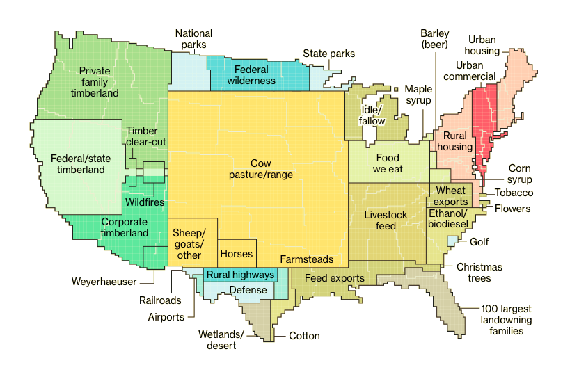
We recently came across a good data visualization in this article on Bloomberg visualizing a rather large data set on how exactly America uses its land. As Nebraskans, we are not surprised to see 40% of the land is used for cows, but it is interesting to note that even though 4 out of 5 Americans live in urban areas, these urban areas only comprise 3.6% of the landmass in the United States.
While reading this article, specifically think about the amount of data actually shown here. In a spreadsheet, this data would likely take up 30-40 tabs and hundreds and hundreds of rows. Yet, you can understand it in as little as one minute by looking at Bloomberg’s visualization.
While not our visualization, we can give you this level of understanding of your data. Let us know how we can help.