-
Pingback: Dashboard Design: Bullet Graph vs. Bar Chart - Contemporary Analysis Blog
-
Pingback: Dashboard Design: Teaching Strategic & Analytical Thinking - Contemporary Analysis Blog
Why Visualizing Data is Important
Visualizing data can make something easier to understand and perhaps keep you awake. Most students have learned that the cure for insomnia is take a difficult concept, like the philosophical concept of determinism, and explain it with words alone. In case you don’t know, Determinism is defined as “events within a given paradigm are bound by causality in such a way that any state of an object or event is determined by prior states.” Asleep yet? But what if you explain that concept with a picture?

Notice how the explanation become more interesting and relevant with a visual aid? I’m sure you had the same reaction as me. Even though I might not care what determinism means, the picture piqued my curiosity and drew me in to explore the topic than I would have otherwise. The illustration makes a hard concept easy to grasp. Download our eBook, “Dashboards: Take a closer look at your data”.
Visualizing a concept has an amazing affect on the human mind. One image can communicate a very complex set of ideas to anyone, no matter your background or education. A well designed graphic can bring everyone to the same level of understanding in an instant. It can also allow you to move from serial processing to parallel processing. You will be able absorb more information quicker and find new patterns.
Our business of predictive analytics and data analysis can be very complex. One of the reasons some companies balk at the idea of doing data analysis is because they don’t understand the what they have. Sales data is usually locked up in a spreadsheets and customer information hidden in reports that are hundreds of pages. Numbers and text don’t tell a story, they don’t spark questions, they don’t inspire creativity. Turn that data into pictures, the story is unfolds, the questions raised, and creativity flows. Data visualization unlocks the potential of almost any data set.
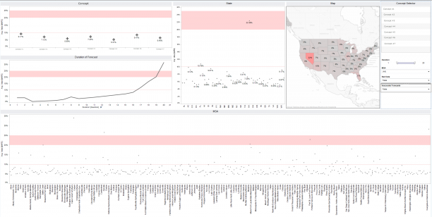
There are times when our answers can be as complex as the question the customer asks. On many occasions our analysis can end up being a long detailed set of reports. This information has to be used and understood by everyone across an organization. It’s one of the most challenging things we do, but can also be one of the most rewarding. For example, for one client we took a 600 page report and visualized it in one dashboard.

The demand for visualizing data is growing. We need people interested in learning this skill. Currently, CAN has several open positions. We have people who are experienced in data visualization and we want to share our knowledge. We provide new hires eight weeks of training on visualizing data, data science and predictive analytics. If you are someone that loves to learn and loves to be intellectually challenged, data visualization is for you.
If this is something that interests you please contact us.
[contact-form] [contact-field label=”Name” type=”name” required=”true” /] [contact-field label=”Email” type=”email” required=”true” /] [contact-field label=”Phone Number” type=”text” /] [/contact-form]
If you enjoyed this post, visit these other related posts from our blog:

