Re-Blog: Why Visualizing Data is Important
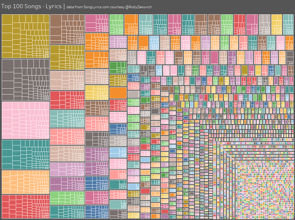
The Tableau data visualization above, found at Tableau Public, shows the “Top 100 Songs of All Time Lyrics”. Click here to hover over each square and see what words were used in which lyrics. Tableau is a software that converts data into graphs, charts, and images.
CAN’s data scientists love sorting through piles and piles of spreadsheets and numerical data, but it’s not for everyone. There are some amazing tools that convert raw data into visualizations. They help bring out the story of data, so everyone can understand it.
Here’s an old favorite from our blog about the importance of visualization. It’s a way for us at CAN to gear up for the next round of Tableau students at the Omaha Data Science Academy!
We are still accepting applicants for the third round of the Oma-DSA! You can apply here. We accept applications until three weeks before the start date, and start a waiting list after the spots are filled.