
Analyzing Omaha Mayoral Election Data Uncovers Voting Patterns
Last week, incumbent Jean Stothert won re-election in the 2017 Omaha Mayoral Election, defeating challenger Health Mello by a 53-to-47 percent margin. Let’s take a closer look at how the Republican fared in the polls over her Democratic challenger.
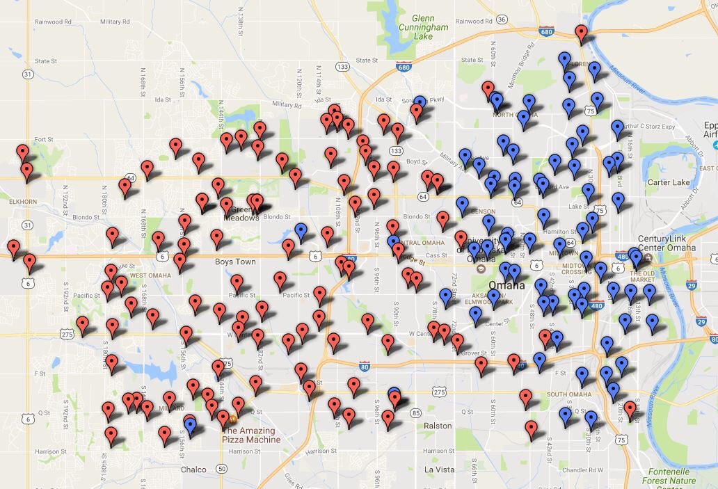
This map was created by the Omaha World-Herald staff shortly after election results were announced on May 9th. It was widely shared on social media in the days following the election and simply represents the results from each precinct — red for Stothert, blue for Mello. It shows a striking political contrast between East and West Omaha. Using this visualization, it appears the city can be divided into two halves, with Republicans on one side and Democrats mostly on the other.
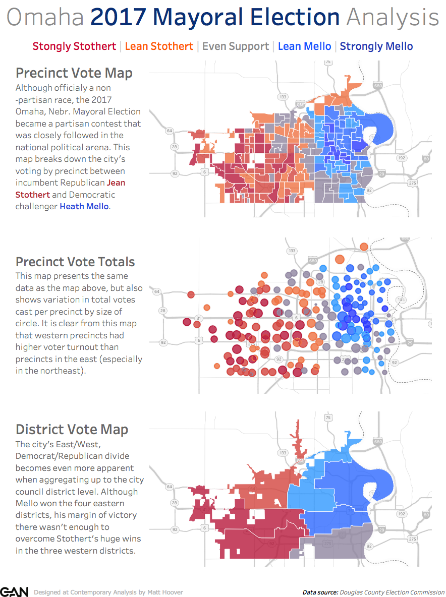
Although the map is technically accurate, it is somewhat misleading because it only shows the data in one dimension. This is not meant to discredit the creator of the map – this is an effective visualization that succinctly tells one story. It is also impressive how fast the map was put together after the election results were announced. With that said, the map doesn’t account for important metrics such as number of voters per precinct or margin of victory. To provide this context and better understand voter behavior throughout the city, I used election data from the Douglas County Election Commission’s website and created some improved, in-depth Omaha Mayoral Election visualizations. Make sure to click on the images if you would like to go to the interactive version of these visualizations.
Red City | Blue City – Omaha Divided
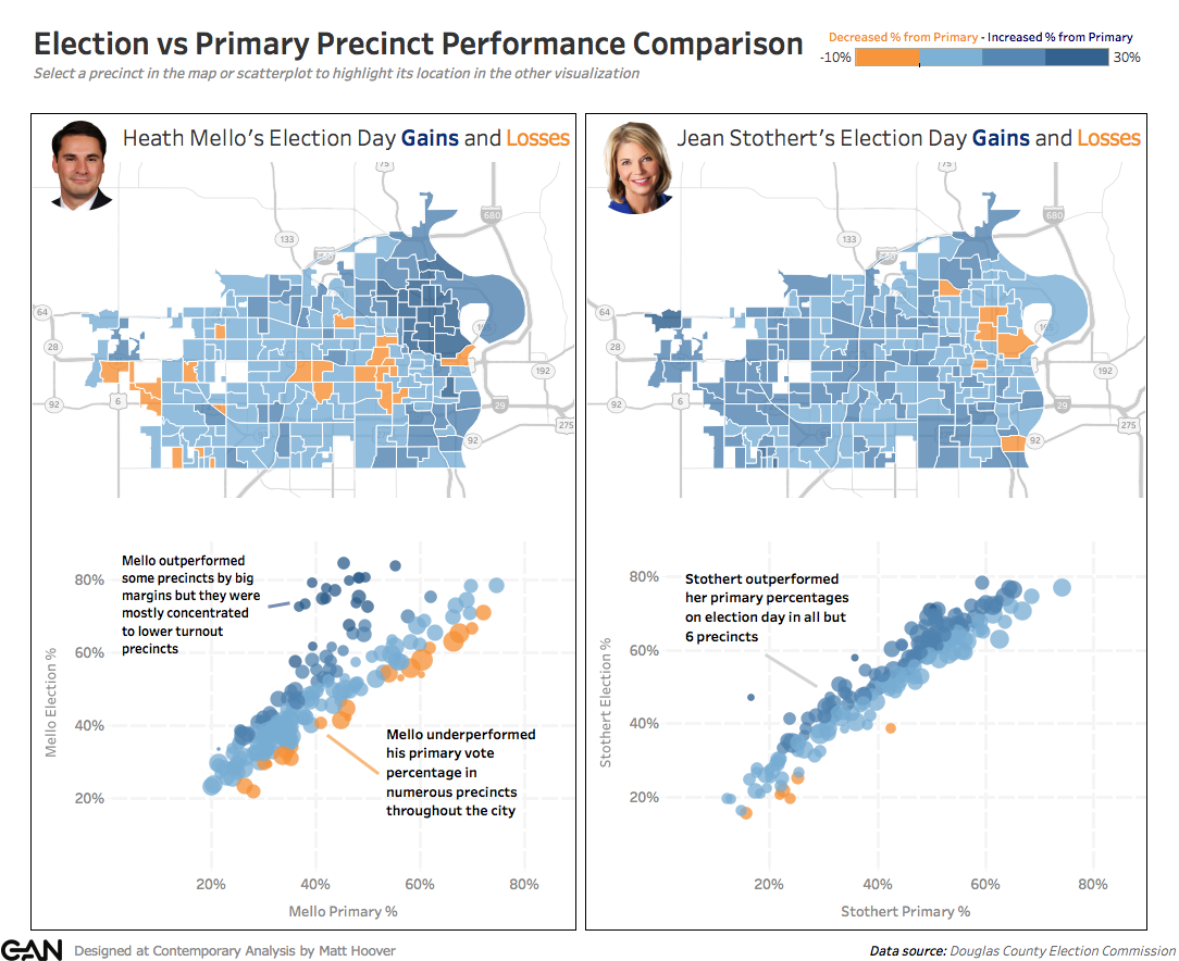
Election vs Primary Performance by Precinct
Were you surprised by the results of the election? What other metrics would you like to see in these data visualizations?